How We Designed the Hiveage iOS App

Hiveage is our flagship product, and arguably one of the best online invoicing platforms available anywhere. It’s a mature SaaS for small businesses with a powerful set of features, serving customers from over 140 countries.
Ensuring a smooth user experience across platforms is essential for today’s SaaS products. We first started catering to mobile users by making Hiveage responsive and functional on all screen sizes. This year, we’re bringing all the power of Hiveage onto mobile through native apps, starting with iOS.
The choice of platform was based on usage: the majority of our customers were using iOS rather than Android, so that’s what we first designed for. Admittedly there is a pro-Apple bias when it comes to the tools used by our team, but our product strategy decisions are based on what makes more business sense.
Paper Prototyping
All design work at Vesess begins with pencil on paper, and the iOS app was no different. Much has been said about why we put so much value in paper prototyping. To quickly recap from our previous post on the responsive redesign of Hiveage:
A sketch is an early attempt at imagining how the app will work in its final form. We’re not worried about the specifics of user interface here: it’s more about facilitating design thinking by eliminating the need for refinement we feel when we use other design tools. Sketching is much faster than grappling with design software, and design collaboration is just a matter of sitting around a table while fiddling with pen and paper.
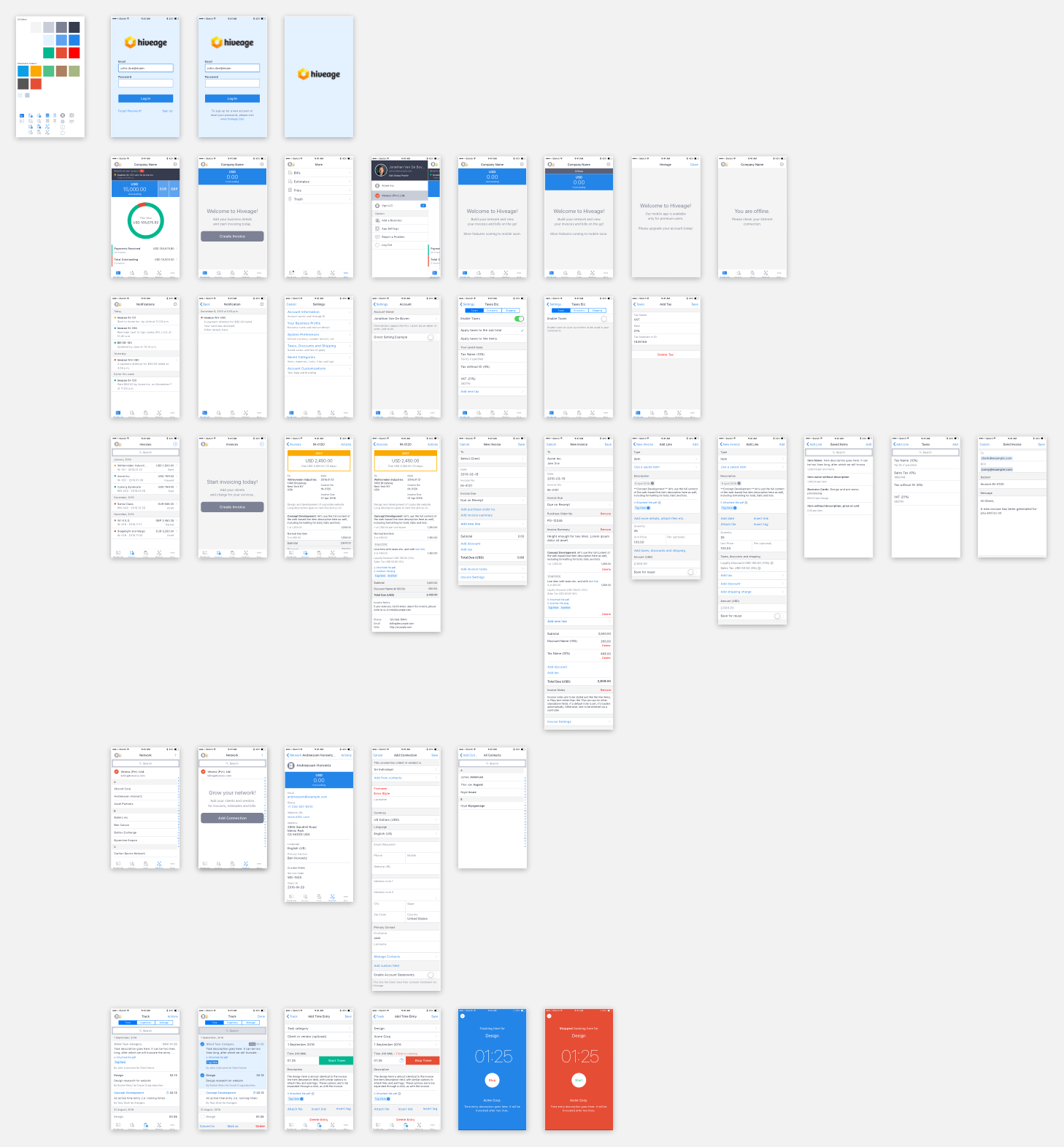
The low-fidelity initial sketches for the app were done on wireframes of an iPhone 6 (I used the POP Sketchpad). These are the actual sketches, in all their rough, unrefined glory, that were shared with the rest of the team. Note the questions and comments, and even entire screens crossed out: these not only indicated the evolving nature of the design, but also acted as an invitation for feedback.
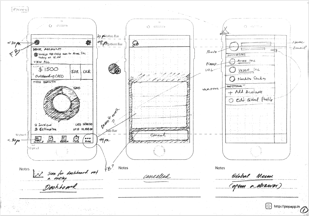
Looking back now, the final design of our app is remarkably similar to these very first sketches. The most important decisions about app layout, workflows and UX seem to have been defined at this early stage and remained mostly unchanged into production. This is mainly because we had completed much of the UX legwork during the responsive redesign of the Hiveage web app, and could readily re-apply that research and design here.
Some of the key principles we adhered to were:
Out of sight, out of mind: Given the scarcity of screen real estate on mobile, it’s tempting to hide features behind menu controls and UI contrivances. However, hiding critical parts of an application behind such UI elements can negatively impact usage; we wanted to keep Hiveage’s main features readily available on the main interface itself. Hence, the persistent toolbar at the bottom.
Obvious always wins. pic.twitter.com/3mggyCypmS
— Luke Wroblewski (@lukew) April 11, 2014
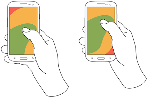
Design for thumbs: The vast majority of users hold their phone in one hand and use their thumb to interact. This means that the most commonly used functions on a screen are best placed within the reach of the user’s thumb. Another reason for the toolbar and liberal use of action sheets.
Follow OS design guidelines: I’ve already used some Apple jargon above (toolbar and action sheet—though they sound generic—refer to specific UI elements in iOS), and this is with reason: we tried to follow the iOS Human Interface Guidelines as closely as possible when designing the app. This can make an app look rather generic, but for a financial tool like Hiveage—unlike, say, a game or entertainment app—the increase in usability afforded by UI familiarity is more important than UI glitter.
Wireframes
Once we had a general consensus on the design based on paper sketches, we moved on to wireframes. These are higher-fidelity sketches that are more refined and able to act as scaffolding for the final visual design.
Wireframes represent the function and workflows of the app, and not how good it looks. They are a great way to nail down the information architecture and layouts of individual screens without worrying about the colours, typography or iconography. In fact, it can be downright counterproductive to include graphical details in them.
After doing a few wireframes, we were confident enough about the design to move onto the next stage. This was partly because we spent a lot of time working on the paper prototypes, eliminating the need for detailed wireframes. Familiarity with Hiveage helped as well: if it had been a novel app, we would have spent a longer time working on wireframes to finalize all workflows.
Visual Design
Then came the most exciting part of this whole process: the complete visual design with all the bells and whistles. The goal: to produce high-fidelity design compositions that our engineering team could use directly to develop the app. The tool of choice: Sketch.
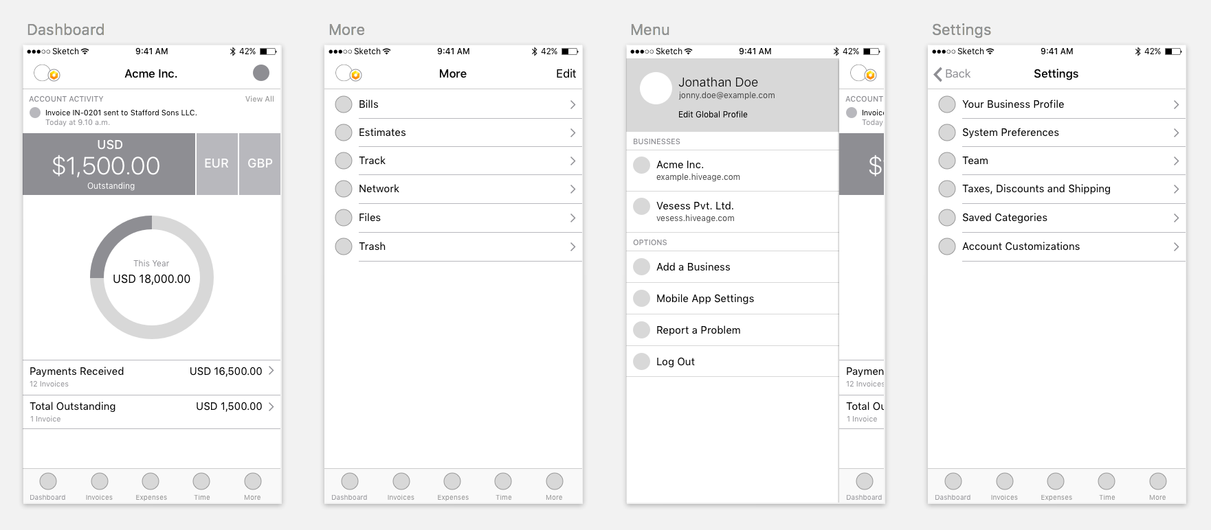
The design was organized in Sketch as a collection of artboards, with each row representing a key feature, and the different states and screens a user would encounter when using that feature inside the app. Empty or zero-data states were not an afterthought but an integral part of these collections. For example, the set of designs for the dashboard included one for how it would look for an active user billing with multiple currencies, and another for a new user who had no data in the system.
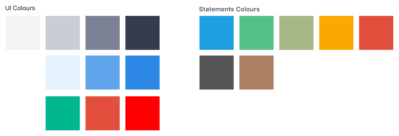
Colours
The colour palette used on the app was based on that of the web app, so this was an easy step. Only two new shades of light grey had to be introduced as we encountered the need for them on later screens.
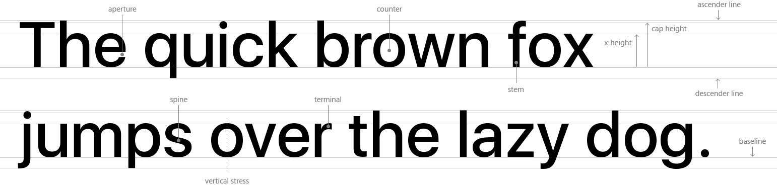
Typography
Apple’s default typeface for iOS, San Francisco, was the only type family used in the design. It’s an elegant and highly readable collection of fonts, and has the added advantage of making the app look that much more native to the platform.
Icons
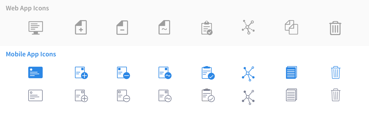
The icons used on the web app didn’t fare well on the mobile. The dashboard icon, for example, had a desktop screen, which was a poor metaphor when used inside a mobile app. We also wanted the icons to be cleaner and sharper, with a clearer distinction between selected and unselected states. We redesigned all icons for the mobile app, but tried to retain their visual similarity with those in the web app.
When presenting and reviewing a design, even within our own team, we always explain the compositions in detail. This helps us keep track of why certain decisions were made, and also facilitates better feedback: if we describe the problem clearly, we might figure out better ways of solving it.
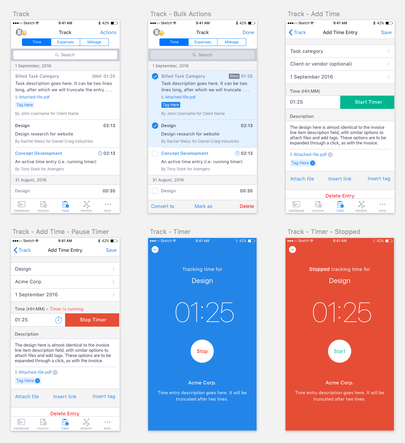
For example, here is my first post on our project management portal explaining the design of the Track section in the app—it’s where the time, expense and mileage tracking features of Hiveage are made available.
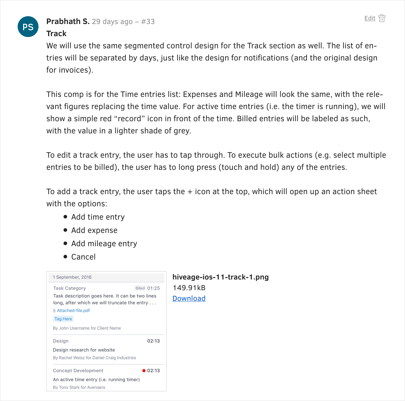
These designs were revised over time, and we ended up with the following compositions for the Track section:
On to Development
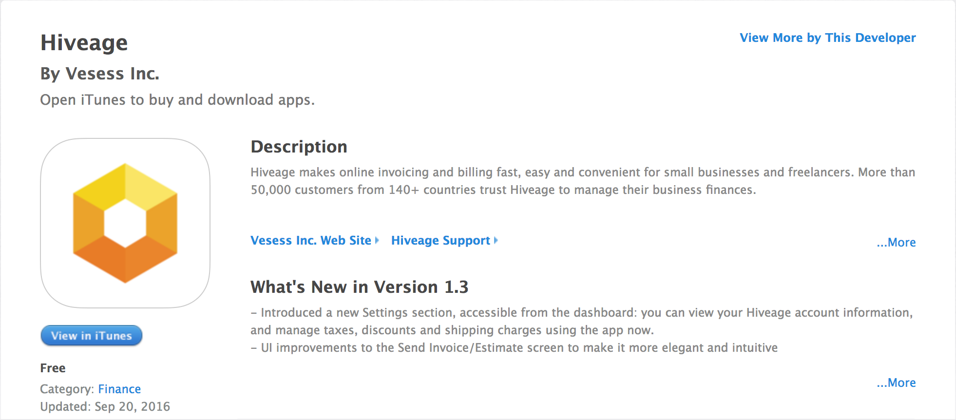
At the end of the design phase, we had two deliverables: detailed compositions in Sketch, and documentation of our design decisions. These were taken up by our engineers, and how they developed the app will be the next article in this series. The Hiveage iOS app is now available in the App Store, and we have a stream of updates planned to make it as powerful as the web app by the end of this year.